Thursday, 7 June 2012
Thursday, 31 May 2012
Wednesday, 4 April 2012
Tuesday, 3 April 2012
Merzbox Project
Back layer of the second side piece for my Merzbox project, which will eventually be holding a bird and then become the first image in the series, showing the opening scenes of the story.
Friday, 30 March 2012
Merzbox Book-box Project
The second part for my Merzbox piece, with the complete layers added. These will be the final images I just need to assemble them and arrange them into the best formation etc.
Wednesday, 28 March 2012
Merzbox Book-box Project
This is the back layer (left) which will make up one of the two side panels of my Merzbox project, when assembled. So there will be the larger main image in the centre and the two side panel images attached either side of this. The image on the right is the middle layer added onto this.
Wednesday, 21 March 2012
Typography 'i' Newspaper brief
Two text designs for the 'i' newspaper YCN competition brief, which I am intending to create repeat patterns from and turn into screen prints, incorporating a giant letter 'i' into the piece.
Thursday, 23 February 2012
Beehived & Honeycombed
Pencil crayon piece created as an entry for the East Midlands 'Where Art Meets Science' competition, centered around the issue of bees and highlighting the importance of their existence (attempting to depict the impact of their decreasing numbers and raise further awareness of this.)
Tuesday, 29 November 2011
Tuesday, 25 October 2011
Spam! Advertising Illustration- Finished Piece
Here is my Spam piece so far, I think it might need some amendments later on, any comments would be great!...Thanks :)
Friday, 21 October 2011
Wednesday, 19 October 2011
'Spam' - Advertising Project
This is the third (and hopefully final) draft/rough showing the composition and conecpt for the 'Spam' advertising brief. (I need to modify the astronaut character still so that the finished piece will have a better (I hope) spaceman instead of a skydiver/mod/stuntman!)
Tuesday, 11 October 2011
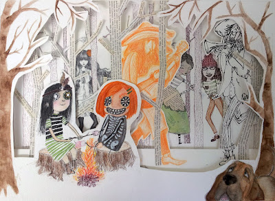
Summer Project Part 2- all three layers
The outcome for the party scene part of the characters project...

Here is the final illustration- with all three layers included, the third of which has my two child characters dressed up in Day of the Dead face paints and one also wearing a skeletal costume as is sometimes done during the festival. The dog is supposed to be confused by what the humans are doing and why they are acting so strangely! The top layer still needs to be refined, and especially cutting out closer to the key-lines, to be able to see more of the background characters and trees, and the overall aesthetic be more effective.
Second Layer
Here's the second and first layer together, for this one I decided to use a combination of styles/ media for the trees as had been done with the characters- to attempt to make it more (or in a way less) coherent in order to incorporate the characters into the setting, convincingly as a complete piece.
I changed the two male characters slightly in order to form a mariachi style band for the guests entertainment. The trees are cut out text from old books, and I hoped the simplistic straight text trees would provide a contrast for the brown ink trees in the distance.
Subscribe to:
Posts (Atom)


.jpg)


.png)


